Sage & Arrow
Brand Identity, USA
#logodesign #slogancreation #brandpositioning #brandmessaging
Runner-Up Logo
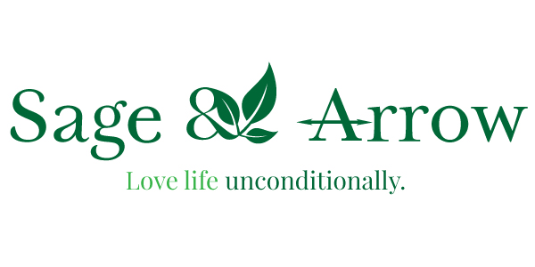
This mockup captured the brand by portraying the leaf sprout as a means of healthy living via holisitic and natural healing/well-being. It had a subtle touch by using 'Tryst' Serif Font to communicate the brand. We further highlighted it by using 2 variants of greens, a darker, primary tone and a lighter color for the slogan.
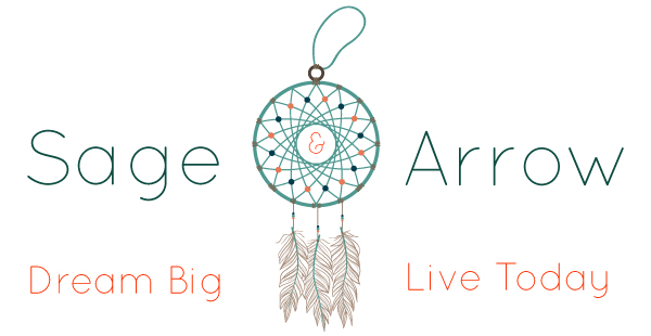
Chosen Logo
When we presented this logo concept to the client, they loved it from the get-go. It was a wholesome representation of their brand. The whole indie and holistic feel was brought in with DreamCatcher element--an ancient Native Indian symbol for positive thoughts and striving for one's dreams. The logo was further enhanced by the Sans-Serif Font of "QuickSand" and subtle placement of "&" inside the dreamcatcher.
Deliverables | #Delivered
Actual Logo
Slogan
Favicon
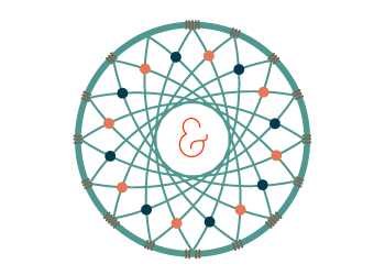
&
Facebook Cover
Praiseworthy | #testimonials
What a joy it has been to work with TorontoIMC for my business logo. Latish went above the call of duty and helped turned my new website into an cohesive brand and beautifully captured my business's mission.